GRAPHIC DESIGN AND ILLUSTRATION > Beacon festival
Illustration and Branding for Beacon Festival

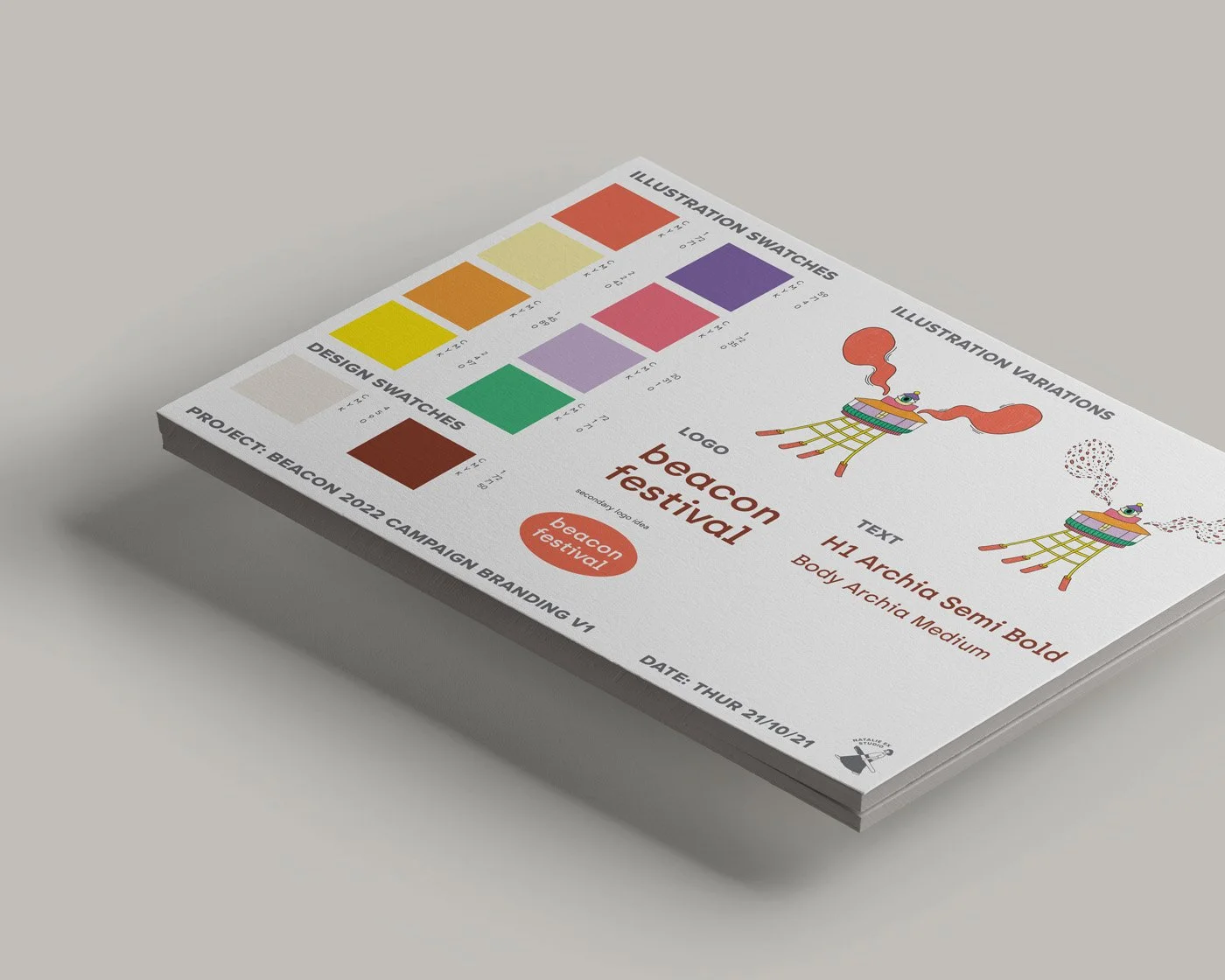
Initial mock ups
Client: Beacon Festival
Project: Key Illustration and Branding
Beacon Festival was a series of music festivals held at Queens Wharf in Auckland, New Zealand. The events were curated by Friendly Potential, a well-regarded event promotion collective and radio show known for championing forward-thinking electronic music. The festival showcased a diverse range of local and international artists, creating an inclusive and vibrant atmosphere for music lovers.
Project brief:
To create a key, hand-drawn illustration of the Beacon Festival lighthouse motif. A softer visual approach than the 2020 Beacon branding was requested, with a focus on minimal, hand-drawn aesthetics, off-white backgrounds, and a slightly sci-fi feel.
Typography direction steers away from the sans-serif styles typically found in music poster design, toward a serif font treatment that evokes a more refined, timeless quality.
Objective:
The goal is to communicate a sense of understated confidence through the updated branding. With a loyal core audience now established through the bold, high-energy visuals of the launch campaign, the brand is shifting to something more mature and grounded, while retaining a unique, playful edge.

-
Playful
Vintage
Hipster
-
Leah (owner)
Trumpet (pet)
86 Tram
Exhibition building
Edinburgh gardens
Vintage clothing
-
Printable PDF
Web friendly files
Separate transparent PNGs for individual illustrations


The festival’s branding came to life across all materials, including the illustrated map which you can view here.
Design approach:
I developed an illustrative style that feels quirky and almost childlike to bring the lighthouse motif to life. Using wobbly, hand-drawn lines and a palette of vivid pastels set against a neutral background (inspired by Japanese colour swatches) the design strikes the perfect balance between playfulness and minimalism.
The use of bold block colours within a softened visual framework creates an aesthetic that is both understated and eye-catching, setting the tone for a music festival that feels confident, distinctive, and imaginative.

Natalie Ex brings 23 years of experience in illustration, graphic design, and marketing. While she specialises in clean-line Japanese inspired styles, her adaptable approach ensures visuals are tailored to your unique needs.