GRAPHIC DESIGN AND ILLUSTRATION > THE JOINT BAR
Logo Design and Visual Branding Refresh for The Joint Bar
Client: The Joint Bar
Project: Rebrand | Logo & Visual Identity
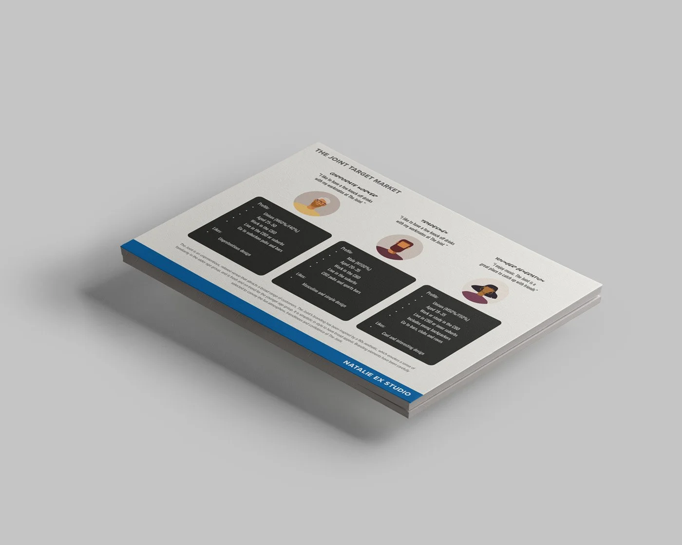
Located on Elizabeth Street in Melbourne’s CBD, The Joint Bar wears many hats: bar, restaurant, DJ venue, pub, and beloved late-night hangout. What sets it apart is its cool-but-unpretentious vibe, a place where everyone feels welcome. The Joint asked for a brand identity that reflects all of its offerings and resonates with the full spectrum of patrons who call it home.
Project brief:
To craft a refreshed visual identity that’s bold, confident, and welcoming, unifying a previously scattered brand presence. The new design needed to appeal equally to corporate workers, young hip crowds, and tradies, all regulars at The Joint.
-
Playful
Confident
Warm and inclusive
-
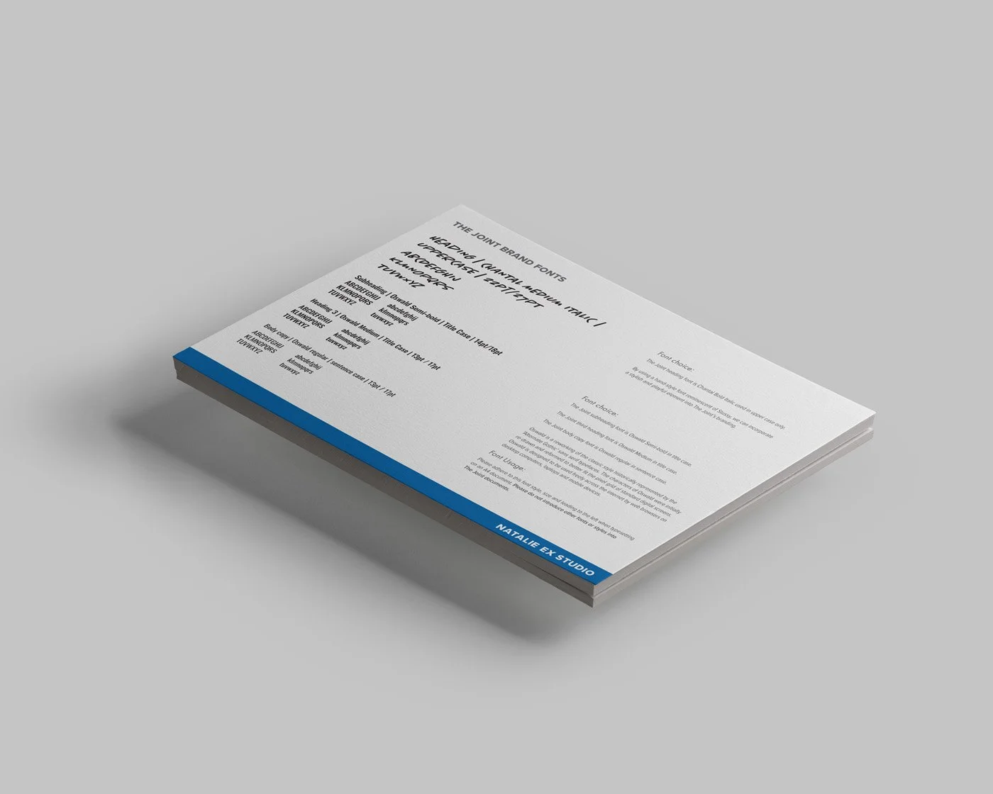
A lowercase typographic logo at the request of the client
A ’90s-inspired aesthetic to strike a balance that’s nostalgic, fresh, and broadly appealing
-
Primary logo + variations in all required file formats
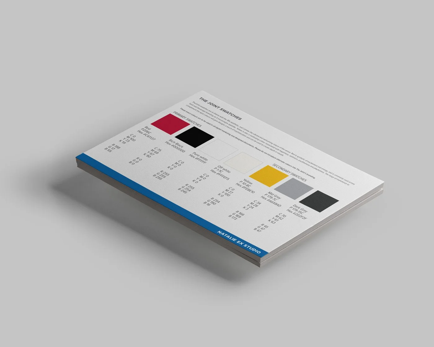
Full visual branding guide: logo usage, icons, typographic hierarchy, color swatches
Design approach:
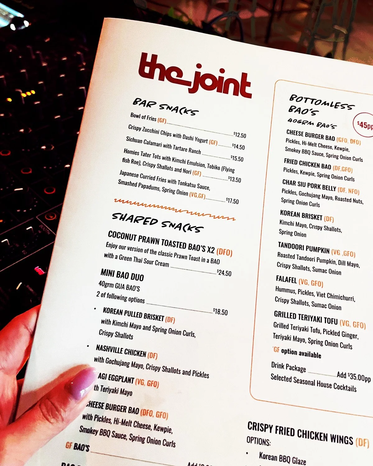
I embraced a bold, streetwear-inspired ’90s style that appeals across age, gender, and background. Mixing a clean, practical body font with an expressive, graffiti-influenced headline font gives the visual identity character and energy.
A playful “squiggle” element to break up text and inject movement was also introduced, because The Joint is all about having fun and not taking itself too seriously.

Natalie Ex brings 23 years of experience in illustration, graphic design, and marketing. While she specialises in clean-line Japanese inspired styles, her adaptable approach ensures visuals are tailored to your unique needs.